Steni Composite Stone Colour Collection
Developed for Urban Environments, The New Re:Colour Collection is Timeless
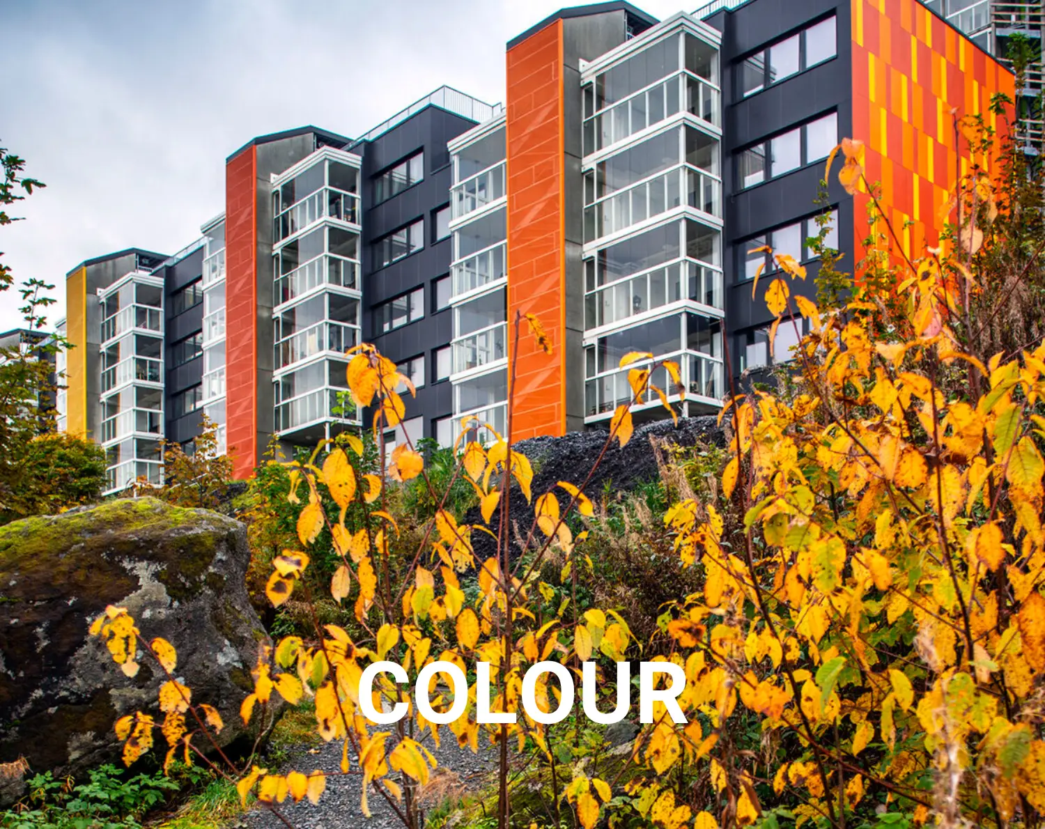
Re:Colour is about safeguarding place identities and applying the use of color in urban areas. The new Steni Colour collection consists of 45 new urban colors. The colors compliment the 15 legacy colors, 10 colors in grayscale, and 10 accent colors. Developed in collaboration with Scandinavia’s leading expert in color and architecture, the new urban colors were developed based on historical colors in urban areas and colors found in nature. The new Steni Colour Collection is timeless.
Formats
Stocked format:
1195 x 2995 mm
Standard production:
295 x (1195 mm – 3495 mm)
395/595/795/895/1,195
x (850 mm – 3495 mm)
Custom production:
(292 – 1195 mm) x (850 – 3495)
Full production width of 1195 mm is always charged.
Click a Color to Order Samples
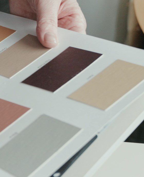 Guide to Selecting Steni Colours
Define the main color, accent color, and contrasting color when selecting color combinations from the new Steni Colour Collection. The main façade color is on the largest wall surfaces and sets conditions for the other colors.
Accent Colors
The accent colors are used on smaller wall surfaces, building volumes, and façade elements. The accent colors should harmoniously blend with the hue tone of the main color. Two accent colors may be used, accent 1 can be used on smaller wall surfaces or larger building elements, while accent 2 can be used on small wall surfaces and smaller building elements.
Contrast Color
The contrasting color is the color that pushes the harmony of the main façade slightly out of balance. The contrast color is usually the color that creates the most contrast to the other colors in the façade, whether it is color strength or lightness. It is the color that activates the other colors and creates variation and excitement in the façade.
Like the accent colors, the contrasting color should emphasize the main color, but with the help of contrast. Contrast colors are used on building details such as doors, gates, framing, floor bands, décor elements, etc. The contrasting color can be from the legacy colors or accent colors.
Steni’s Communications Manager Jan Terje Nielsen is pleased with the new colors:
“We had a fantastic collaboration with NTNU and Kine Angelo in the development of the collection. Our goal has been to produce colors that are applicable to the architects’ needs and local colour guides both in Scandinavia and internationally. The feedback we have received from architects who have looked at the collection has been overwhelmingly positive.”


